The Tahoe Project: Rustic Allure Meets Modern Sophistication
This savvy businesswoman (let’s call her Shannon) isn’t just conquering her career — she’s also acing her real estate investments with this piece of Tahoe paradise. When she reached out to us about furnishing the main home and leading the guest house build, we knew she’d found a property with real potential.
The Game Plan & Design Direction
To merge the home’s original architecture, Tahoe’s natural setting, and Shannon’s refined sense of style, we knew there was only one way to go: juxtaposition. We paired earthy hues with contemporary furnishings and rustic allure with modern sophistication. Turns out, opposites do attract. (You knew that already, didn’t you?)
We started with the main home and our usual process — design concept, renderings, procurement, installation — then moved on to the guest home. Although this project isn’t done yet, I can’t resist giving you a front-row sneak peek…
Main Home Design: Comfortable Family Room
In the main house, our primary focus was fixed on the dynamic duo: the family room and the great room. Despite coming up with two design options for the family room, our mission was the same: create and furnish three zones for lounging, working, and playing.
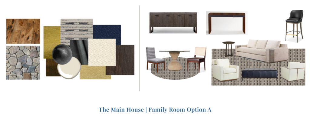
Option A plays it softer with a mix of lighter tones, classic shapes, and a more contemporary feel. To ground the space, we threw in some dark navy and noir accents.
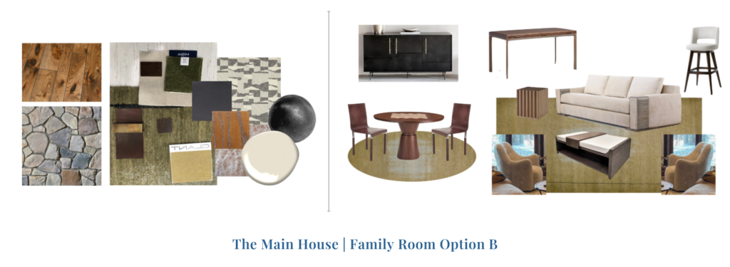
Option B feels more modern and nature-inspired yet still refined. It brings a greater diversity of hues into the mix with touches of earthy greens and more warm wood tones.
So, which one did Shannon choose? You’ll have to wait and see. (I know, the suspense is real.)
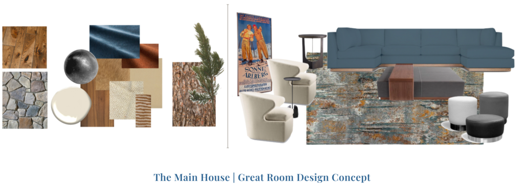
Main House Design: Inviting Great Room
In the great room, AKA the heart of the action, we knew we had to go big. Whether our client is up for some lively nights with a glass of Pinot, slow afternoons with a good book, or a competitive Scrabble showdown, this space is up for the challenge.
We artfully wove together a rich palette infused with hues of soothing blue and warm umber, perfectly complementing the wood tones found throughout the space. To counterbalance the moody finishes, we opted for cream-toned upholstered swivel chairs (Shannon loves a swivel).
We also designed a custom sectional and handpicked soft ottomans that moonlight as extra seating or a place to set a tray and wine glasses — perfect for hosting. To be continued…
Guest House: The Design Direction
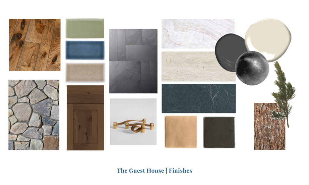
Tucked into the property lies a ground-up build with a show-stealing guest house. It has a kitchen for culinary creativity, a living room for lounging, a powder room that packs a punch, and a bedroom that doubles as an office. When it comes to the design, our hands were in every detail of this space.
Our approach for the guesthouse took a contemporary twist with clean lines and more refined elegance. We crafted custom millwork, selected every light fixture, designed window treatments, sourced hardware, and much more. (When I say every detail, I mean it.) The guest house is still under construction, but I can give you a full preview this time, thanks to our secret weapon: renderings. You’ll see what I mean…
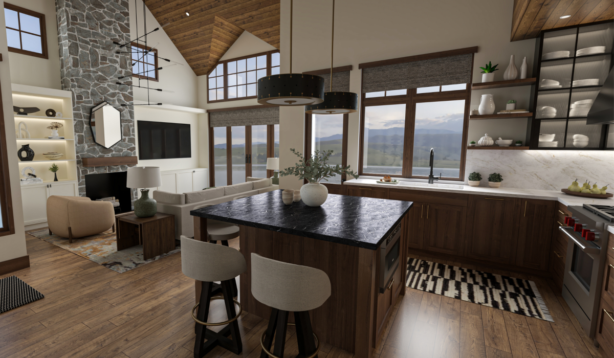
Guest House: Rustic Yet Luxurious Kitchen
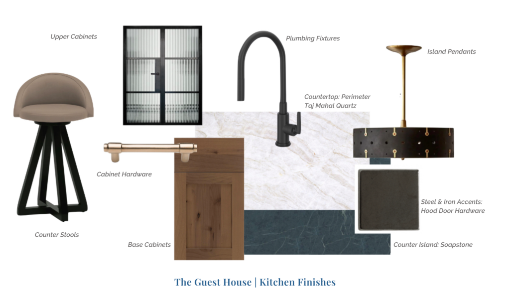
Step into the heart of the guesthouse, where the kitchen isn’t just a kitchen — it’s a culinary playground. We chose dark, modern finishes, stunning quartz, drool-worthy soapstone, all framed by matte black plumbing and brass finishes. With Shannon’s thumbs up, we channeled our selections into these beauties:

Completely different experience, right? Seeing a design board with the color palette, finish selections, and furnishings is NOT the same as seeing the space’s potential with your own eyes. We gave Shannon these two options to choose from. Can you spot the differences? (Hint: Bar stools, lighting, wallpaper, staircase, window treatments, and rug…)
Here’s another angle… mostly so you can see the full glory of these funky geometric pendants:

Can you spot the differences? Which do you prefer?
Guest House: Nature-Inspired Living Room
As you saw above, the living room is just steps away from the kitchen, which means it must be designed uniquely yet cohesively with the kitchen. We curated the furnishings and selected finishes in a way that seamlessly fuses the two spaces, resulting in a cohesive great room.

Both options capture a natural yet elegant feel. They include the same patterned rug, neutral sectional, side table in walnut, and textured olive table lamps. The differences? Well, the built-in is pretty obvious, isn’t it?
Though both built-in options are sophisticated, the painted version feels brighter and more contemporary, while the walnut has a more nature-inspired and mid-century feel to it. We paired each with different window treatments to complement them. (Design is ALL about balance.)
So, which did our clients choose? Sorry, but the suspense continues…
What’s Next?
Opposites really do attract, and that’s exactly what we’re proving in Tahoe — where rustic charm meets refined luxury. Both the main house and guest house blend the best of the location, the home’s architecture, and Shannon’s personal style. Proof that you don’t have to confine yourself to just one thing… and that it’s more fun when you don’t!
Whether you’re gearing up for a renovation, furnishing a new purchase, or preparing to build a home from scratch, we’re here for you. From Hawaii to the Bay Area to Tahoe, we’ll make the experience both enjoyable and rewarding.
Cheers,
Melanie
