7 Characteristics of the Fresh Transitional Design Style

Chances are good that you’ve heard of transitional design. It’s a blend of classic and traditional style but with a more contemporary, modern look. However, by that definition, the term “transitional” could apply to just about any mix of styles. You know we love clarity, so we couldn’t resist taking things further…
In our style quiz, we recently coined the term Fresh Transitional. What is it?
To us, Fresh Transitional design has a timeless foundation yet leans contemporary, clean-lined, and minimalistic. The ratio isn’t 50/50 between traditional and modern styles. It’s closer to 40/60 or 25/75. This balance lets classic pieces and architectural details shine — without dating the space.
If you love timeless yet fresh spaces, here’s how to do it….

1. Muted Color Palette
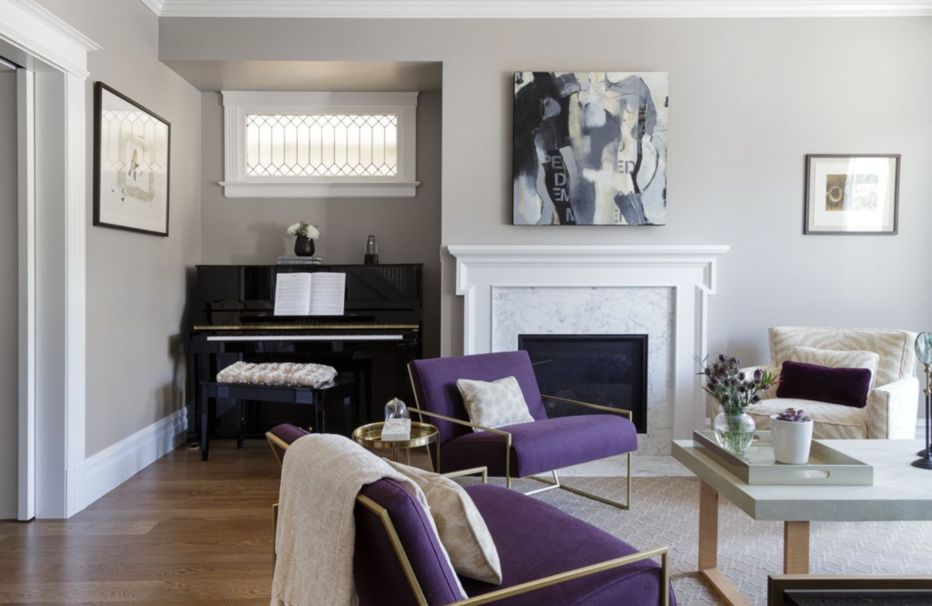
The foundation of Fresh Traditional design is a muted color palette, like warm grays, whites, taupes, or creams. These colors provide a sense of calm, make spaces feel brighter and more open, and offer simplicity and sophistication that balance traditional design. Before you imagine a boring, white room (not on our watch), consider your neutral color palette a blank canvas.
A foundation of neutrals gives you the freedom to thoughtfully layer elegant furniture pieces, luxurious textiles, and subtle patterns that stand out in a timeless way, as shown in the living room above. Deep jewel tones add warmth and refinement among more traditional architecture and trim. The result is a space that feels fresh yet timeless. (Tip: Aim to carry a neutral palette throughout all public spaces to create cohesive elegance.)
2. Authentic Materials
Fresh Transitional design also loves incorporating raw and natural materials. With them, you can create a timeless environment with a fresh, modern feel. The balance of natural vs. engineered textures and materials creates depth and character that stands out rather than appearing flat within a room. Examples? Hardwood flooring, white oak cabinets, a natural stone fireplace, and more.

3. Balance Heirlooms
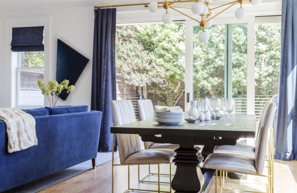
I’ve lost track of how many times clients have come to us with “heirloom” items, like the traditional table shown above or a beloved chair. These well-loved pieces are ideal candidates for adding a classic (and personally meaningful) edge to the design. Depending on the piece, we may also recommend refinishing the piece for an updated look, reupholstering it in a fresh fabric, or simply modernizing its surroundings to create something new.
All of these options are opportunities for Fresh Transitional style, blending vintage decor with a new, modern aesthetic. Note: When incorporating a very traditional-style heirloom, it’s important to design the room with a higher ratio of contemporary and modern pieces to keep the space feeling balanced.
4. Understated Traditional Shapes
Truly traditional designs are known for elaborate and ornate details. Think gilded frames, clawfoot furniture, bulky and dark furniture, thick ruffles, etc. These pieces can quickly feel dated in a home, and if you love a more modern look, they’re probably not for you. However, a Fresh Transitional interior includes pieces that bridge old and new by favoring understated traditional pieces.
For example, furniture with cerule rather than ornately carved legs would be great for bridging classic curves with clean-lined edges. Bed skirts that are straight versus ruffled would be the perfect Fresh Transitional option for a bedroom. These types of understated, traditional pieces can serve as a design bridge with more modern finishes, offering visual relief and a pop of freshness. Yes, please.

Photographer: Vivian Johnson
5. Millwork for Character
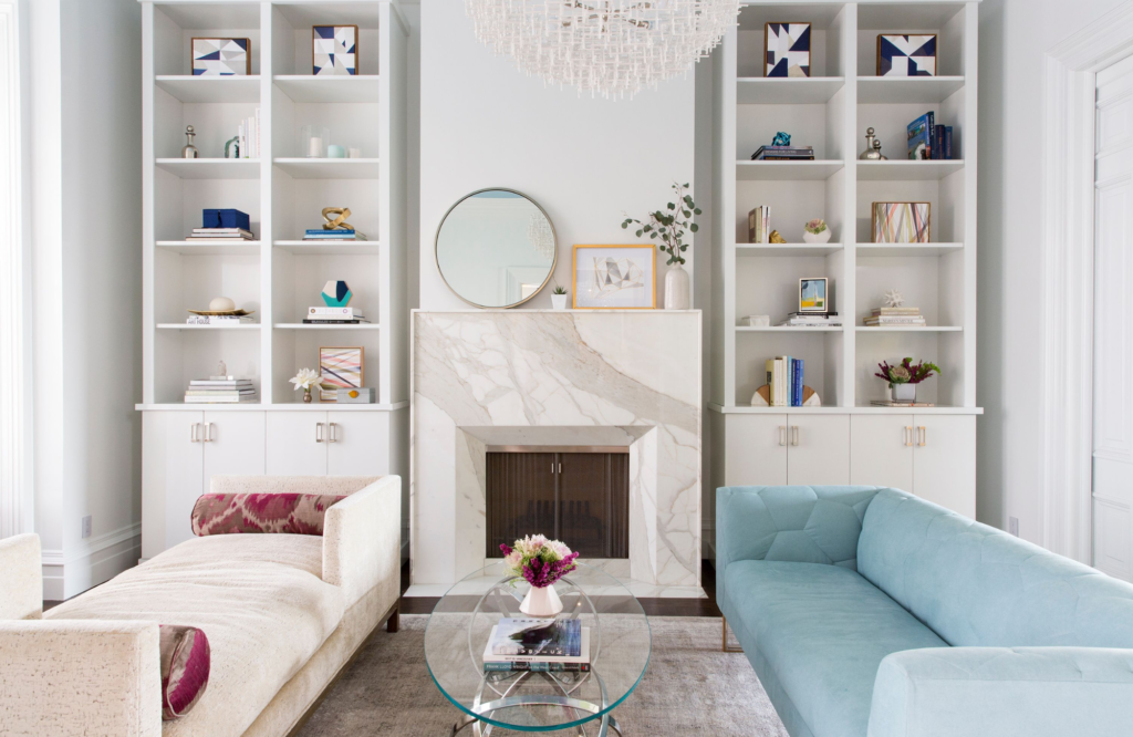
In a Fresh Transitional interior, millwork is often used to create a classic and timeless look through moldings, trim, paneling, built-ins, and other decorative elements. You’ll find spaces with modern decor centered around traditional millwork or vice versa.
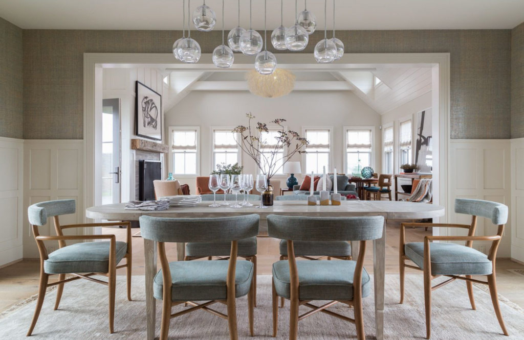
If your space includes a high proportion of traditional-style millwork, we may consider painting it in a neutral color, such as white or gray. This creates a fresh and clean look and offsets the traditional feel. We can also create character and depth in the space by adding wainscoting or an elegant wall base for a sophisticated, finishing touch (like in the dining room shown below).
6. Visual Comfort with Textiles
Textiles create a visual experience as much as they do a tactile one. In Fresh Transitional interiors, the right rugs, fabrics, and finishes can add warmth and comfort to the space. We like to use woven rugs, drapery, Roman shades, or upholstered furniture to create the balance we’re looking to achieve. The thicker the textiles we add, the more luxe, cozy, and often traditional the space.
For a Fresh Transitional design, we like to create a balance of thick textiles (like velvet or heavy drapery) with smooth and sleek textiles (like a low-pile rug, silk pillows, or sheer drapery). This creates comfort and freshness that is guaranteed to last.

7. Art for Personality
Fresh Transitional design is one of the safest styles you can choose — because there is no one right way to do it. Each space is a blend of our clients’ homes, their lifestyles, and the things they love. That said, the final piece in creating a Fresh Transitional space is tying the whole look together…
…with art. If you already have a piece you love, we can use it as a launch point for your design. If you don’t, we will source art pieces that complement the finishes in your space, create cohesiveness, and add your unique personality to the room. Bonus? We may recommend a TV that poses as art when it’s off! Perfect for hiding the eyesore and swapping out “art pieces” over time. Genius.
Take Our Style Quiz
So, what did you think? Is the balance of old and new right for you? If you’re still unsure of your signature style, have some fun and take our style quiz here.
Then, reach out to us to talk about how we can help you bring it to life. Whether your result is Fresh Transitional style or something else, we’re here to help.
Cheers,
Melanie
Credit: All photography by David Duncan Livingston (unless otherwise noted)