How to Put the “Great” in Your Great Room Design

Great rooms are dominating modern-day design, and it’s easy to see why. You can cook a meal while keeping an eye on the feisty toddler in the living room. There’s room for enjoying the fireplace, doing homework, and entertaining guests, all in one space.
Safe to say, a great room can be the central hub and heart of the home… but, they can be tricky to design. Today, I’m sharing the top 3 elements that make a great room “great,” along with 5 styling tips to create distinct zones in your open concept space.
The 3 Key Elements of an Incredible Great Room
1. Clearly Defined Spaces
The mark of a cohesive great room is that you can be in one area without really noticing the other. So, for instance, you can sit on the sofa laughing at Jen Sincero’s witty dialogue in You Are A Badass without being distracted by your kids rummaging in the pantry for their third afterschool snack. It all depends on how you separate the spaces.
2. Functionality
In a great room, functionality is key and you’ll want every element of the space to be serving a purpose. For example, furniture that can move from the dining area to the living area for extra seating when guests visit. I also recommend placing the dining zone close to the kitchen to avoid awkwardly walking through the living area carrying plates of food.
3. Layered Lighting
In a great room, each distinct area should have its own light source. You don’t want to turn the kitchen light off and have the entire space go dark! This might look like pendants over the kitchen island, a chandelier over the dining room table, and a statement lighting piece in the living space.
The lighting also separates the areas and allows you to set the mood you desire in each. I always suggest creating a lighting plan that includes both prominent ambient lighting and lamps for task lighting.
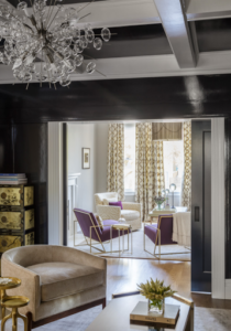
From our San Francisco Style Project. Photographer: David Duncan Livingston.
5 Tips for Creating Zones in Your Great Room
1. Create a Dining Zone
Most dining zones achieve natural separation thanks to the kitchen island. This gives the space a beginning and an end without you having to try too hard. However, island or not, you can also add a statement chandelier over the table to give this space a presence of its own. We love to select an eye-catching piece that contrasts with the pendants over the kitchen island for a unique look.
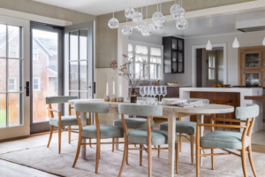
Photographer: David Duncan Livingston
2. Don’t Get Too Matchy-Matchy
Our best advice is to NOT coordinate all of the furniture in your great room. For example, your barstools shouldn’t match your dining chairs which shouldn’t match your lounge chairs. Why? The excessive matching makes it feel like one large area. (Although, if that’s your vibe, we say go for it!) We suggest using a variety of fabrics, colors, wood tones, shapes, and styles to offset one area from the other. Like this home:
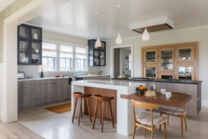
Photographer: David Duncan Livingston
3. Anchor The Living Area
Large rugs can help anchor and define spaces in a great room, and the living area is perfect for this. The struggle? Finding the right size that fits the scale of your room. Although designers disagree on the right approach to sizing a rug, we stick to the rule that a properly proportioned rug has a grouping of furniture fully on it.
When selecting a rug, especially for the living area, think about the amount of traffic through the space. Is your kiddo into building LEGO towers? Or is the area more formal with light traffic? You can use our guide to indoor and outdoor rugs that are worth their salt to determine the right rug for your space.
Pro Tip: At Coddington Design, we’re not big fans of area rugs under a dining table. Moms know what we’re talking about!
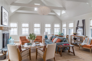
Photographer: David Duncan Livingston
4. Add Architectural Details
Architectural details like beams or soffits on the ceiling can also help create division between the dining and living areas in your great room. Even better…it gives your eyes a visual stopping point. Another option is to consider custom built-ins to define your spaces and increase functionality. Style and storage? Yes, please!
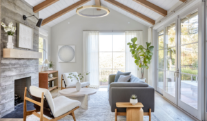
From our Scandi Modern project. Photographed by Vivian Johnson.
5. Color & Wall Treatments
Bold colors and distinct wallpapers are all the rage right now. They’re visually attractive while adding the necessary depth and texture to your space. Bonus? This is another way to create distinct spaces within your great room. Consider wallpaper behind shelves or a bold color for built-ins. (More tips for sprucing up your wall decor here.)
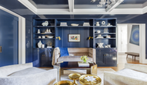
Photographer: David Duncan Livingston
Not sure where to start? Take our Style Quiz to discover the aesthetic you love and go from there!
Cheers,
Melanie